Toki
3M+ users didn't want a plain chatbot.
They wanted intelligence.
The Bet
Chat UI made sense in WhatsApp and Telegram. In a standalone app, it just made the AI look like it was talking too much.
I bet on structure over conversation. Show the action, not the explanation.
The Work
Three design decisions shaped this product along the way.
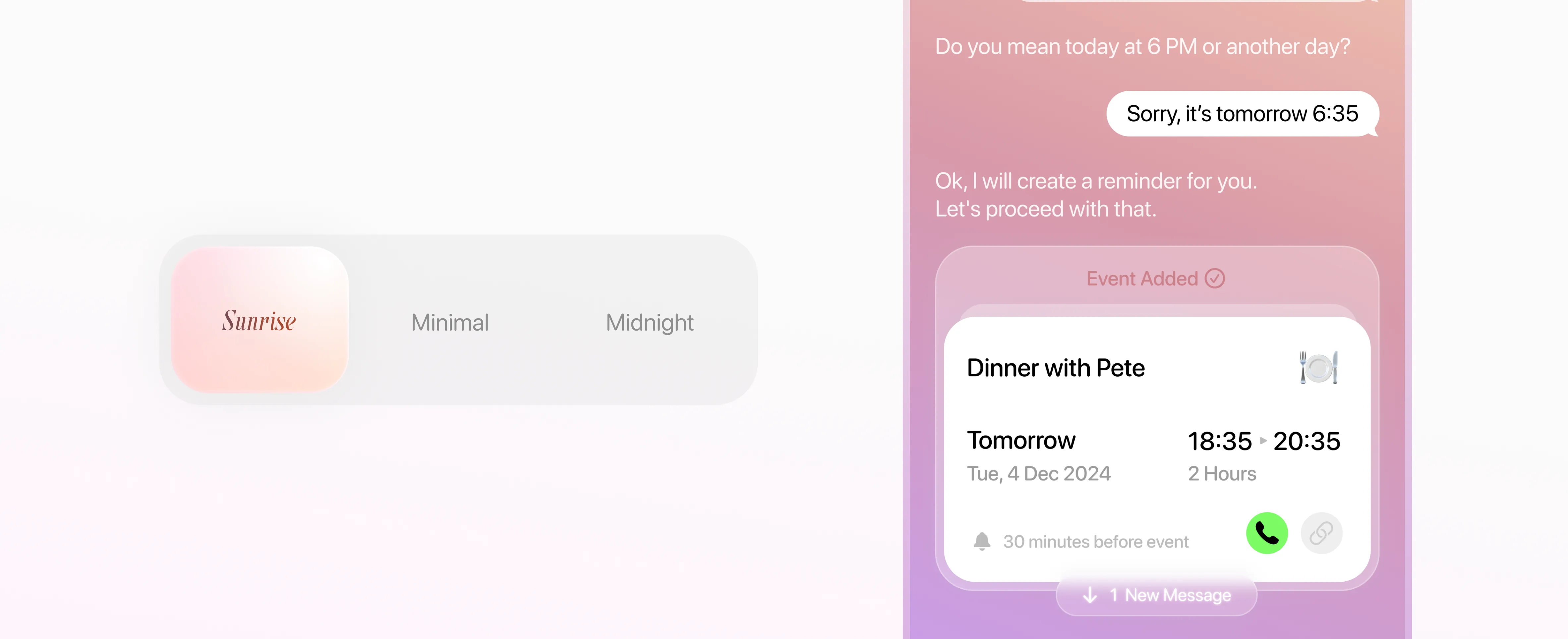
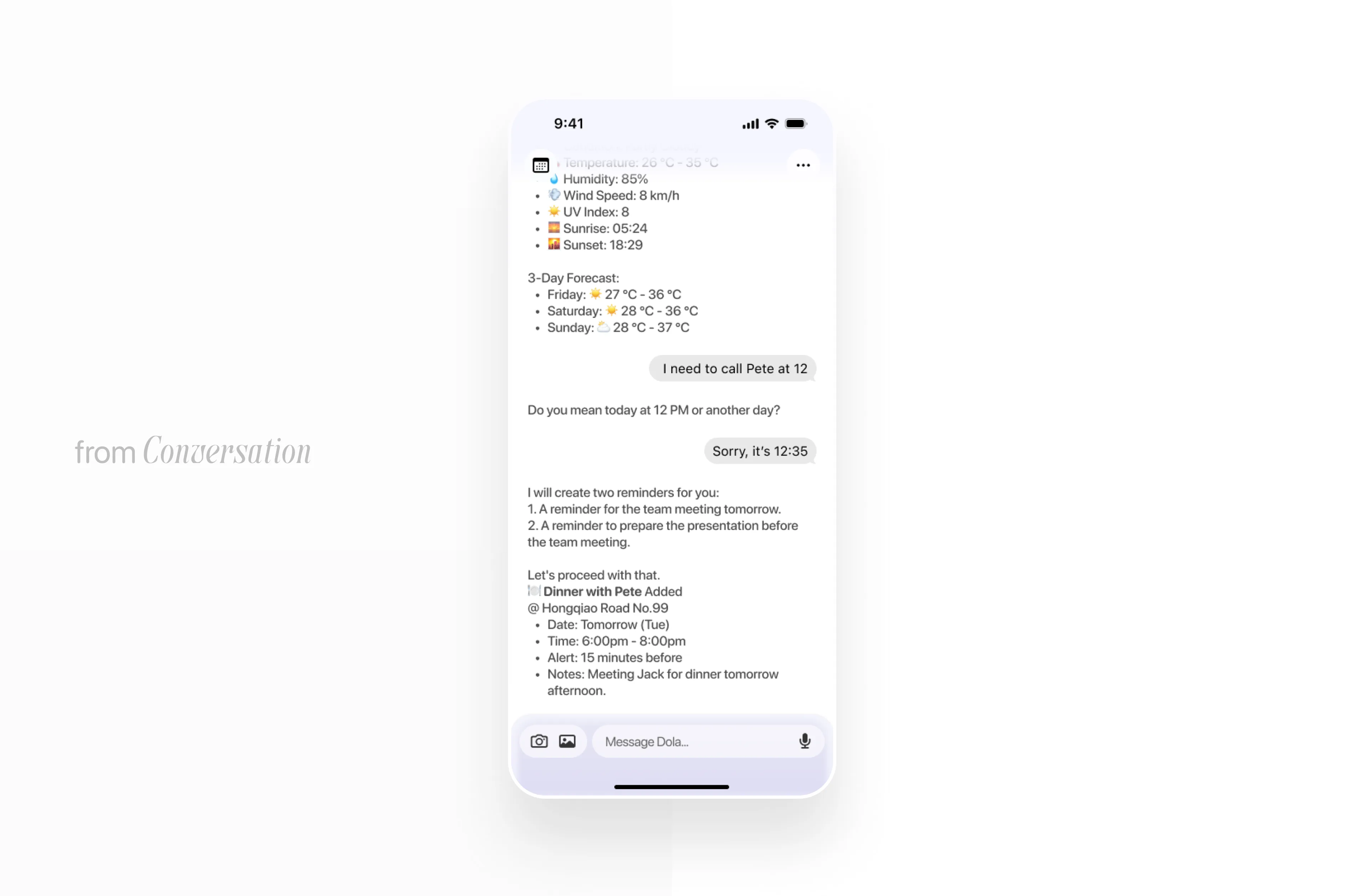
From conversation to Card
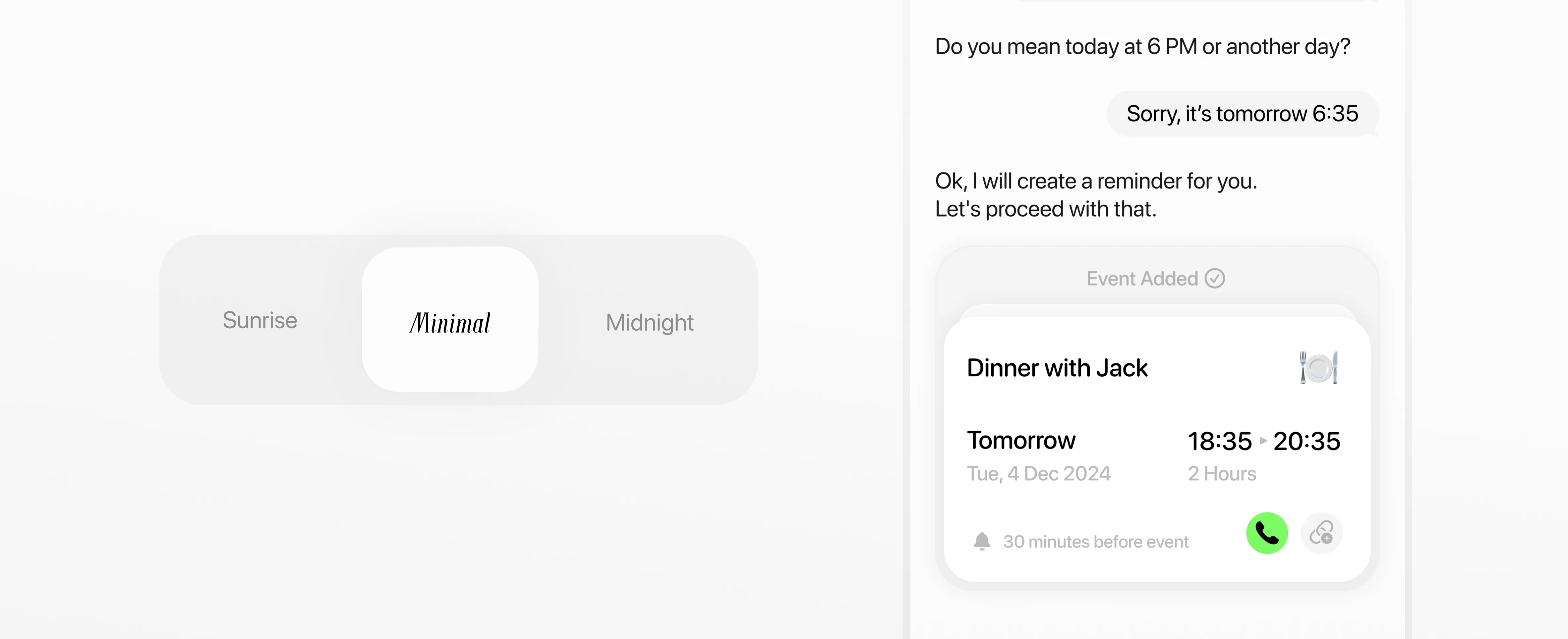
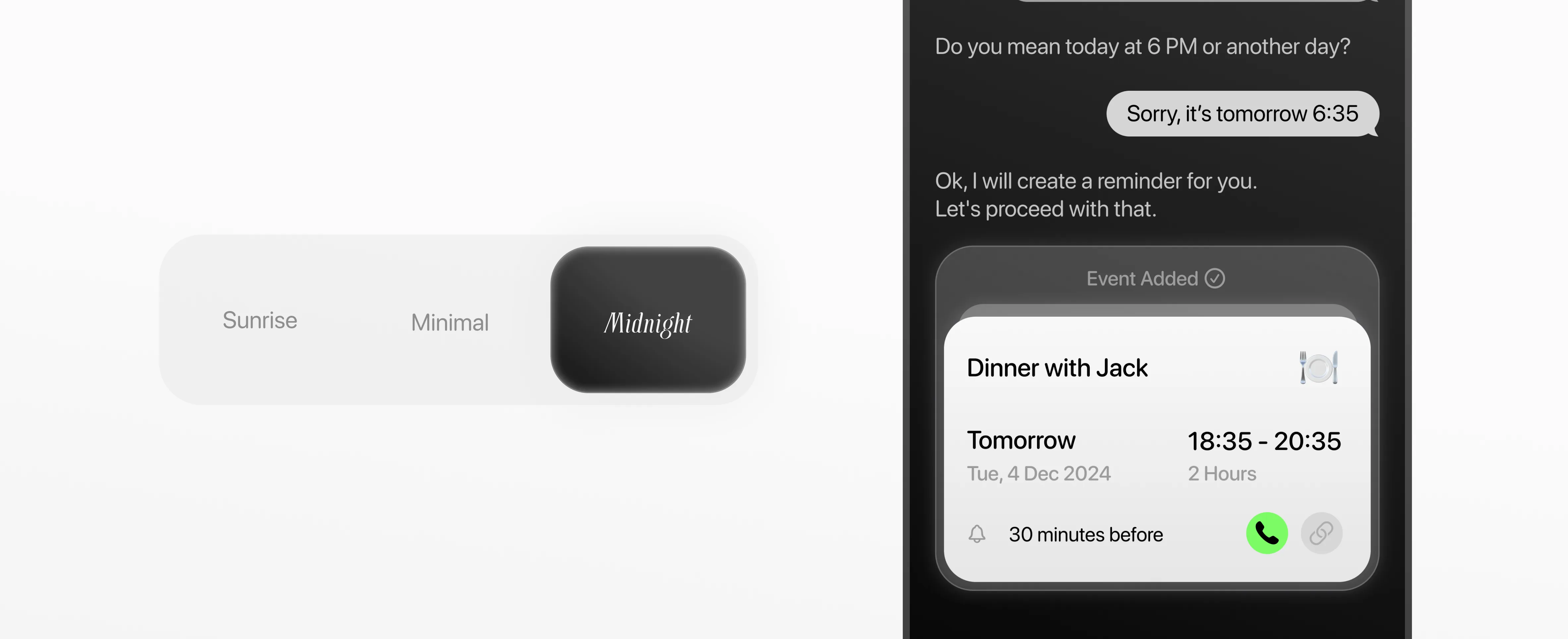
The original plugin replied in paragraphs. Users had to read to understand what happened. I redesigned the output as structured cards, each action the AI took became a visual object you could see, tap, and trust.
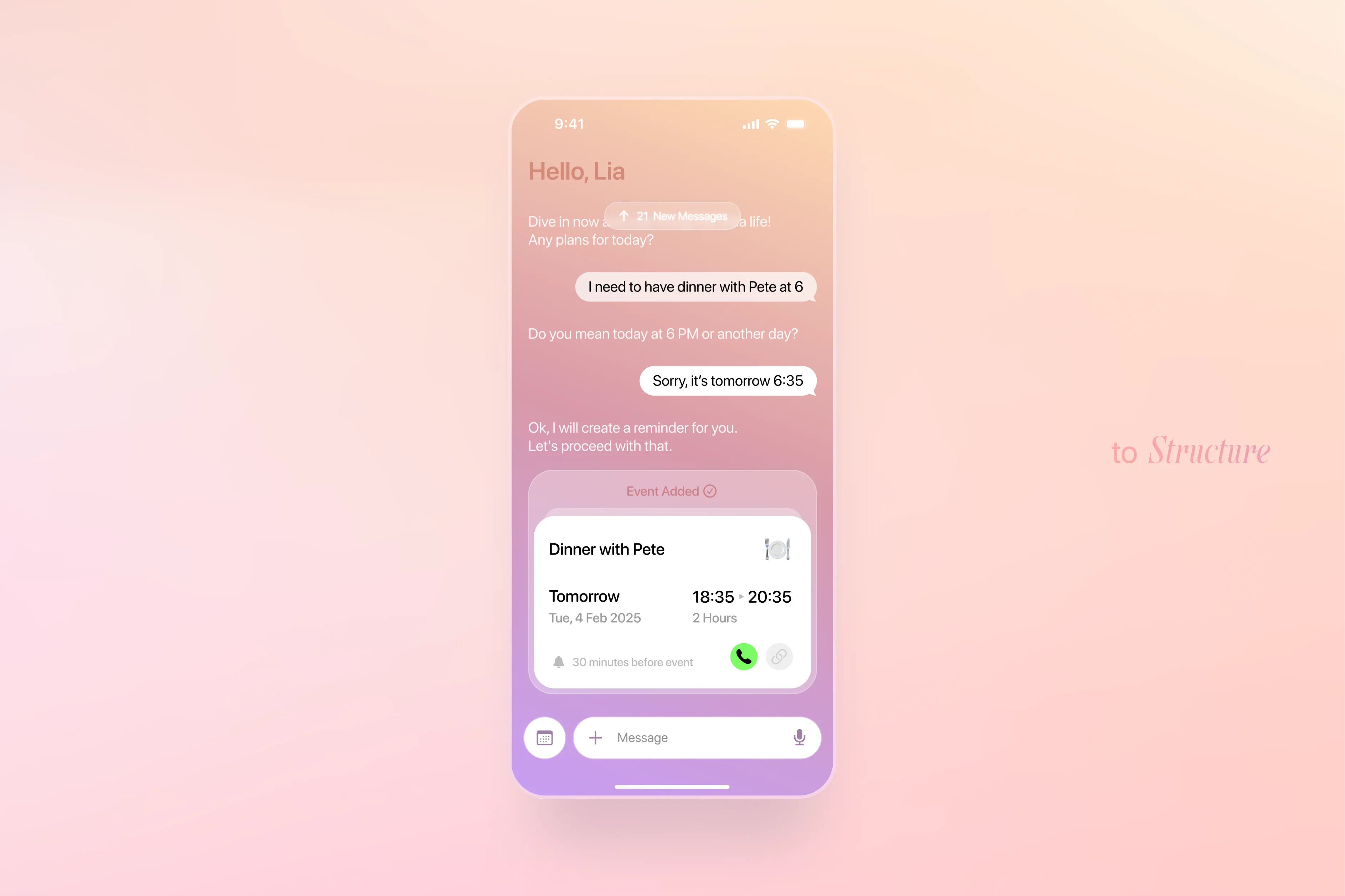

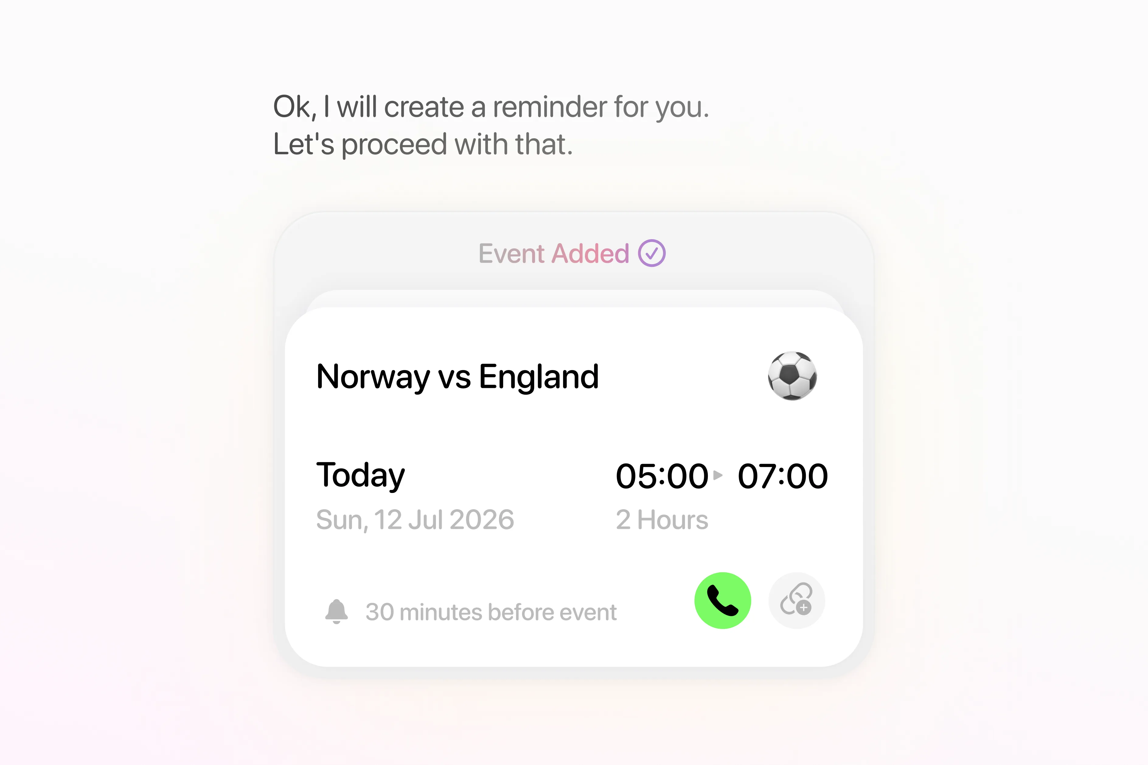
Design the moment of Trust
The card wasn't just visual, every button placement and micro-interaction was deliberate. We went through many iterations on what information to surface, in what order, and how to make "AI did this for you" feel like relief, not risk.
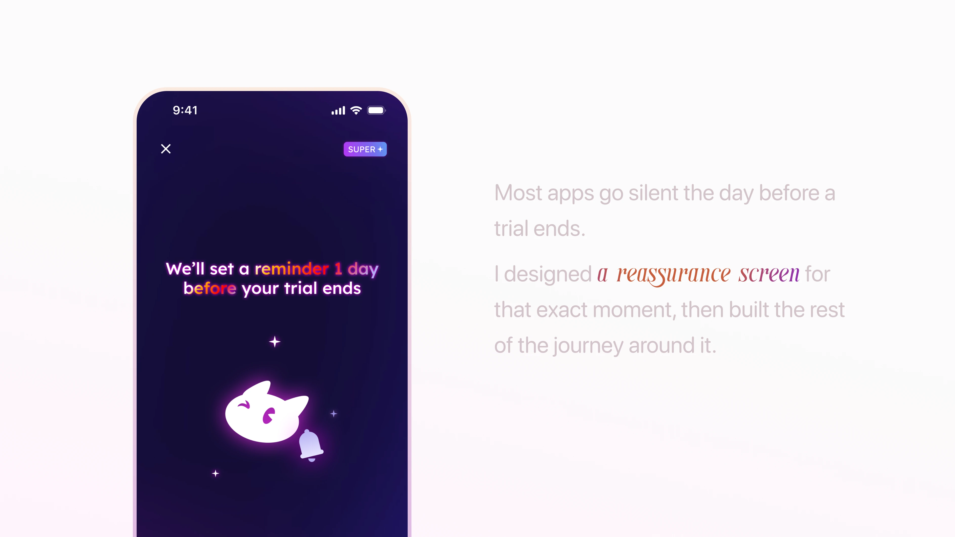
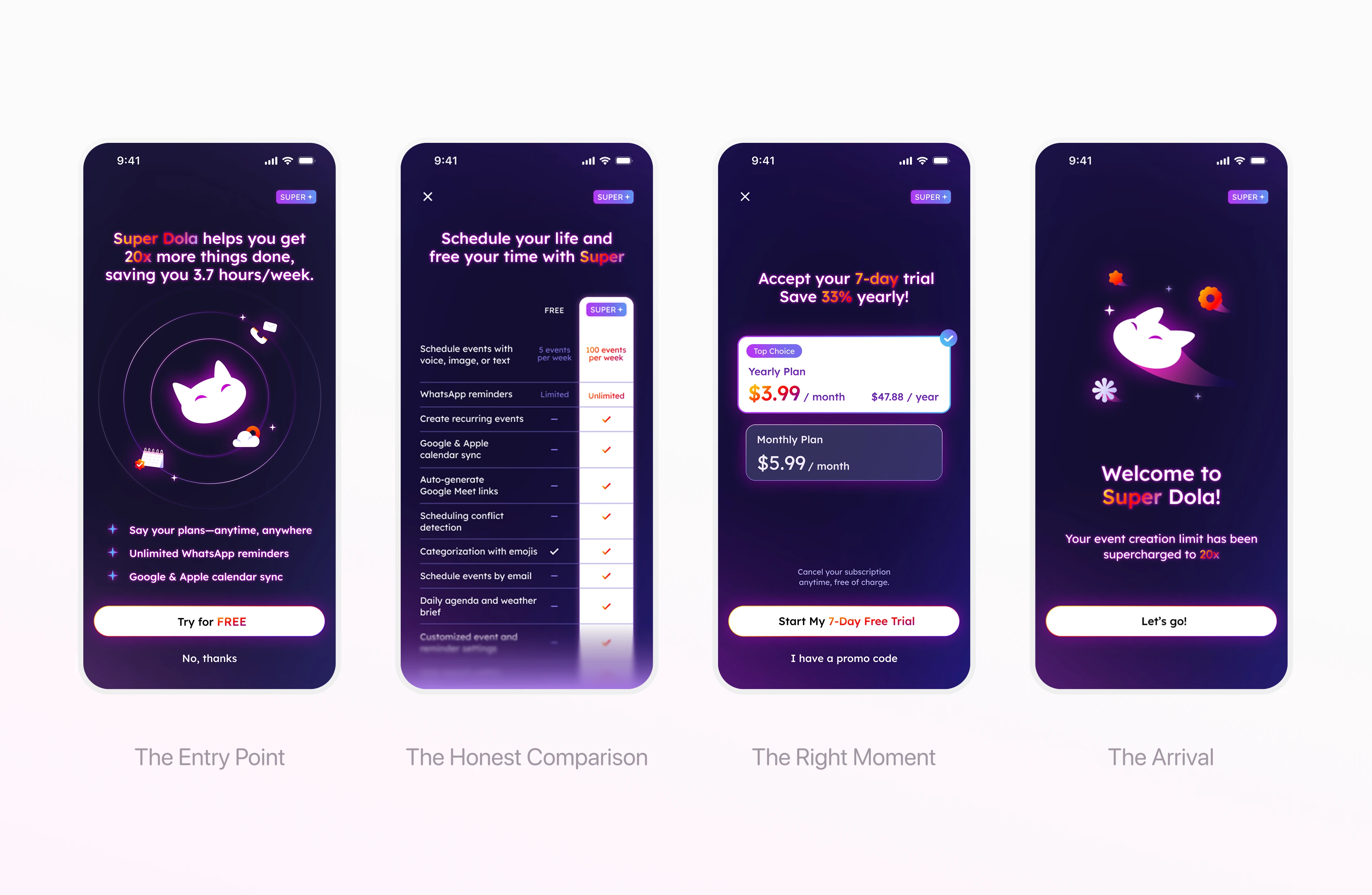
Premium as a Journey, not a gate
Working closely with the marketing team, I redesigned the subscription flow: shortening the path without skipping steps. Every screen had one job: move the user forward without making them feel even a tiny bit of rushed or pressured.
The Impact
3M+ users across the platform. The card UI became the foundation of Toki's visual identity as a standalone app.
Role
Founding Designer
Timeline
2024 to 2025
Type
AI Productivity